This "from" only shows when the user has more than one sending address (another sending alias)
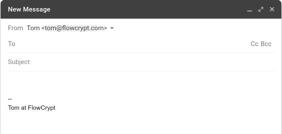
Gmail makes it pretty obvious that it's "from"
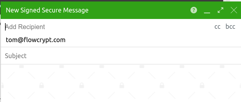
Our own UI is a lot less obvious, and can confuse the user:
Todo in this issue:
- add
From and To (and Cc / Bcc) to the left of the input fields
- switch order of inputs:
From should be above To and others
- (maybe)
From would not have to be visible in "collapsed" (unfocused) view. It's only needed in the expanded view, similar to what Gmail does
This "from" only shows when the user has more than one sending address (another sending alias)
Gmail makes it pretty obvious that it's "from"
Our own UI is a lot less obvious, and can confuse the user:
Todo in this issue:
FromandTo(andCc/Bcc) to the left of the input fieldsFromshould be aboveToand othersFromwould not have to be visible in "collapsed" (unfocused) view. It's only needed in the expanded view, similar to what Gmail does