Devlog: Steven
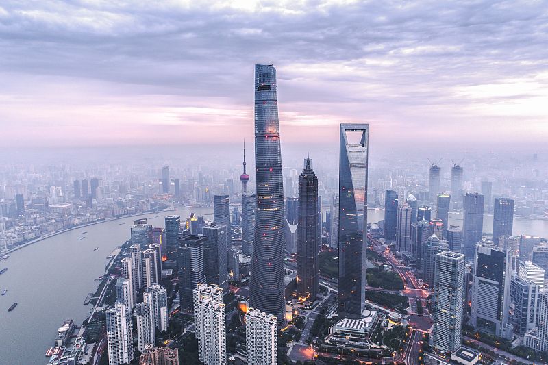
Devlog 12: From my perspective, the Shanghai Tower could represent modern architecture. First of all, buildings nowadays have a high requirement for the materials they use. Designers always spend lots of time studying advanced techniques to create the structure and make the appearance look cool. The Shanghai Tower is a vivid example of the unique use of modern materials. The whole building is covered with glasses. It creates a two-layer structure. People standing outside the building could see the interior part. The sunlight would cover every corner which save lots of energy. Moreover, the buiding is Asymmetric, which is also a typical trend of modern buildings. https://www.arch2o.com/wp-content/uploads/2012/10/Arch2O-shanghai-tower-marshall-strabala.jpg
Devlog 11: The technique of dealing with the boundary in the game inspired me a lot. In the article, they used two ways to make the player feel the game is endless. The first is to create some events, like a traffic jam. The second is to make a complex scene. In our game, the 2D boundary would make the player feel quite uncomfortable because it directly cut the environment. Now we are trying to applying the second method in the article. We put some dungeon entrance on the side, pretending that the space is unlimited. This would create an illusion for the player that space is prolonged to a far distance without adding extra resources.
Devlog 10: The room I spent most of my time staying in is my bedroom. If someone steps into my room, the first thing that would catch his eyes would be the three big screens laying on the table. They are put side by side, which would indicate that I need a board scene to browse the information from the computer. They might guess I'm a designer or an IT engineer.
The second thing that would indicate my interest is the painting on the wall. It lost some color since the long history. It was drawn by me when I was 6. The stroke on the painting is quite simple and childish. This item shows that I love drawing since I was a child.
Devlog 9: I was intersted in how light works in fps games, although our game is more like a top-down third-person game. Lijiang tower in Overwatch gives me some inspiration in light management. The map was built in a night scene and the whole environment was surrounded by darkness. To make the map readable and guide the two teams to encounter each other, the designer in Blizarrd use some awesome light design techniques. They make the main route decorated with white direct light in order to make sure most of the characters such as tanks and gun players would have conflicts through this path. For the secondary paths, they apply several spots of light to make its brightness slightly darker than the main road. It creates an appropriate atmosphere for characters with high mobility such as ninja to utilize this route. Since our game is built in a dungeon, the two biggest challenge when dealing with lighting is how to guide the player clearly and create a horrible atmosphere. The example of the Lijiang Tower gives us a perfect reference.
For now, we are working on the texture and the lighting. We are trying to unify the texture since the style between characters and the environment is a little bit weird. Also, we are adding the lighting effect on torches to make the map more readable.
Devlog 8: Before I read this article, the first thing I would do from my instinct when encountering with brightness problem was adjusting the lighting. However, the writer gives me a really useful suggestion that the average texture value could also affect the brightness of a space. The texture is related to the reflection of the objects, which would create a strong mixed lighting effect. In my game, there would be lots of scenes with different themes, like a snow mountain with iceboxes and white enemies, a green-background jungle with wooden boxes, or barrens with grey stones. It would be a big challenge for us the adjust the textures. We would not only try to not make them too similar in texture value (distinct an icebox from in the snow world, but also set a standard value for each scene to emphasize the diversity.
Q:Now that you've settled on your final project, what aspects are you looking forward to most? What is causing you the most concern? Seeing how the module generation would work would be the most exciting part for us. Getting use of the technique from the talk we watched last week, the module design method is so efficient to create tons of levels since our game consists of cubes and boxes. For now, we are a little concerned about the AI design for the level. The way of attacking is in our game is different from traditional RPGs. Players kick the box to deal damage to the enemies or merge Boxed into powerful weapons to kill them. For this feature, the player's action would be quite unpredictable. How to react to players' diverse actions by AI designs would a big challenge for us.
Devlog 7: The technique that stands out for me is the layer insert. While he is talking about the kits used in level design, it is a brand new strategy that I think is efficient and useful. However, I would concern that the level would generate a sense of duplication for players which is unavoidable when using a bunch of modules. The technique of layer inserts perfectly dismissed my worries. As the example he raised, the rock kit would easily create a cave surrounding. However, the module would make the border, especially the corner quite unnatural. It might be a big problem when we deal with nature scenes. The Layer insert breaks the duplication and cuts the angle into a smooth curve. This technique can also be applied to interior-level design- a broken building, for example.
For me, I would definitely use the 'Bethesda' workflow for level design practice. In my mid-term project, I have encountered a big problem that the train carriages, which occupy most of my paths and spaces, are super complicated. If I made them one by one, the effect would be super cool but it would be over-scoped. Then I tried making the carriages into small modules first, just like the 'Bethesda' workflow and combined them together with different orders and angles to generate a diverse game scene. It is super-efficient and saves lots of time, or I would never finish the mid-term project on time. After watching the video, I totally agree with the methods he provides, no matter what scene the designer is making, the 'Bethesda' workflow would always be the most efficient one.
I would work on the project called "Sokoban Alchemist", which is also my thesis project. The game is based on the rules of traditional Sokoban games, but we made it into an action-adventure game. The gameplay would happen in an open world inserted with linear levels. The challenges, or what I'm interested in to make this project is the module map design and AI design. Every single element in this game consists of cubes, including environment, characters, enemies, and objects which can be utilized. This feature gives us the inspiration to build a Bethesda-like workflow. I'm quite excited to use this technique. Also, I want to learn more about AI design through the process. In order to maximize the diversity of AIs attributes, I might spend time studying how AIs detect the player, how AIs react to different situations, and how they can counter the attack.
Devlog 6: Anthropometry actually gives me lots of instructions. The level of mine consists of lots of cabins and doors. Also, one of the mechanics is the double jump. In the latest version, players would always hit the upper of the cabin, which doesn't affect the gameplay but subtly break the game experience. I would reconsider the height and the width of the cabin. Since my level is based on narrow spaces, every detail of the walls and doors would make big difference.
Fortunately, I finished the first goal of my midterm. Taking Greg's suggestion, I made the main station and cabins into small modules and combined them with each other to generate the whole level. This method saves lots of time and works really well! The scope is no longer a problem for me. After the in-class playtest, it comes two new directions of my mid-term project that I'm going to optimize. The first is the orientation. The first half of the route mainly consists of train cabins. The duplication of the structure makes it a little bit confused for players, especially when they stand on the top of cabins. It would make them get lost since there is no clear sign to indicate where to go next. My strategy to counter this problem would be adding triggers to the key points in the map. It both serves as the lock and key mechanic but also may play the role of a guide. Moreover, I would add more scenes for players to use the grappling hook, since now there is only one location for them to use this mechanic. The proportion of the using hook is much smaller than the other two mechanics, which is quite unbalanced.
Devlog 5: The most interesting feature of Ueda's architecture in level design is that the protagonist can reach almost any part of the world, which makes it possible for players to preview or review the space he/she has reached or hasn't explored. This design enhances the coherence of the whole gameplay. It also creates a stronger sense of immersion since players would have an anticipation for the incoming levels. In the sound monster level of Half-Life, the designer used the same strategies that it allows players to preview the puzzles he would meet in the next few minutes.
The biggest challenge for me now is the scope. My level contains the train's cabins and the structure of the train station. The first half of the route, especially the interior design of the cabin requires lots of details since it serves for the main route and puzzles. The complexity of the interior design could make the scope too large for me to finish the block-out before the deadline. The number of doors, the distance between two cabins, and even how to vary different cabins require lots of tests and considerations. Every subtle change would give the player a completely different experience. My first goal, for now, is to find a way to finish the cabin part of the level efficiently and quickly do the test to adjust the experience for players.
Devlog 4:
My level of the midterm project would take place in a subway station, which would include both the railway and the interior structure. The station building would be set on the ground. The classic map in CS1.6 called Train inspires me to select this space. Two aspects draw me to select this space. The first is that the classic map in CS1.6 called Train impressed me a lot when I was playing it during my childhood. The scene in this kind of public transportation space would give players a strong immersive feeling. layout of the cabins has lots of potentials to make fun experience. Another element is the contrast between the inside structure and the overall train layout. I think it is very fun to design a space mixed with narrow cabins and large spaces.
I would choose Grabbing hook and lock&key. which I think has a strong puzzle and action feeling. These two mechanics would work well with the feature of the station and cabins.The reading this week also gave me lots of inspiration for my midterm project. The pass-by spaces and pass-through spaces are two typical structures in a railway station. Also, I think entrances is another interesting structure. The entrance (door) on the train and entrance of a public building would vary a lot.
Devlog 3:
#1: Are there any architectural techniques or stylistic approaches used in Bruder Klaus Chapel, or the Hadid's London Aquatic Center, that you might consider applying to your own work? If not, then what other spaces inspire you?
The way how Hadid organizes the structure in London Aquatic Center inspires me a lot. The organization creates a coherent sequence and emphasizes the light qualities of materials, which creates a sense of smoothness of the whole space. For my own project, in order to strongly convey the atmosphere in the scene, I could utilize the structure layout to emphasize the attribute of the materials. For example, I could use angular walls as borders in an ice world to illustrate the cold temperture and slipperiness.
****#2:Find a picture on the internet of a space, structure, an interior of a real-world room. It needs to be architecturally distinct, that you feel has potential as a gameplay space. ****
- Player can only grab on the black shelf to survive. - limitation of movement
- Enemies are invisibly floating in the air. You can only see them through the reflection on the water. - perception and prediction
- You have a gun with limited bullets. Hit an enemey would gain a bullet. You can also shoot the leaves on the water to get a clearer view. - resource management and bonus
http://www.whirlwindsteel.com/hubfs/Blog_Images/04%202017/4-28%20metal%20building%20interiors.jpeg
Devlog 2:
#1: Which tips did you find most useful in the video and how would you see yourself using these tips in your own practice?
Landmark is the most useful tip for me. For large-scale level design, I would easily get lose and don't know where to jump in at first. According to David Shaver, the landmark is a good way for standardizing at an early stage. By first editing the landmark, the designer would always see it from distance and shape every sub-level accordingly. For functionality, the landmark is a neat way to draw players to a certain direction, they would clearly know where to go at just a glance. The landmark would also bring an experience of coherence since it is always in the perspective.
#2: Were there any tips or techniques that personally didn't resonate with you, or you felt yourself wanting to try differently from how Naughty Dog used them?
I do agree that the language of shape plays an important role in level guidance. But how David Shaver summarizes how different types of shapes would affect players didn't resonate with me. He mentioned that round shapes are non-threatening, rectangular shapes are stable and diagonals are viewed as aggressive. His theory is based on our recognition of nature and is not convincing in special scenes. For example, in a level builds in a background of space, artificial diagonal platforms might be useful for players while round objects could represent asteroids which are harmful. The key point is to let players learn how shapes are connected to affordance and denying affordance in different level designs.
Devlog 1:
#1: After seeing the video, do you personally feel more drawn to the more traditional approach of engaging in architecture pre-Wittkover? Or are you more interested in in how Wittkover abstracted everything in Alberti's projects?
Personally speaking, I am more interested in how Wittkower abstracted everything in Alberti's projects. The way how he analyzed is like the progress of a revivification of the building. After eliminating the exterior elements, people would have a much clearer perspective to read the initial and elegant structure. Designers could penetrate the appearance to see the essence. The basic and abstract arrangements show a clear logic from the architecture. In the video, the basic lines and shapes give us a straight way to detect the conflict of the exterior facade and reveal the interesting human psychology behind the building. For our level designer, this method is worth learning. The basic arrangements of shapes and lines in the architecture field are like block-out boxes from the early stage of sketching levels. It could give us a clear abstract layout and lay a foundation for further developments.
#2: Can you think of a building where you live near or visited where its appearance is at odds with its purpose? Where the architectural form clashes with its use? Feel free to riff a bit here. Picture would be nice but optional.
Shanghai South Railway station is an important hub for travelers to switch transportation in Shanghai. It serves most trains to the cities of Zhejiang and the Southern provinces of China. The building looks like a giant UFO laying on the ground, which looks modern and fascinating. However, the circular structure is at odds with its purpose of efficiently sending travelers to ports. When people are inside the building, the looping space would easily make them lose direction. The building doesn't have a corner or end. The lack of landmarks makes it hard for people to locate themselves and quickly find the best route. It causes the result that people who are not familiar with this building would easily miss trains.